
Packaging design
X 0.00
Y
02
morrow.case
ROLE
Packaging design
TYPE
Concept project
FOCUS
A consistent product family

Case notes
Morrow is a self-initiated skincare packaging concept built around two everyday products: a daily serum and a soft cream. The design uses a consistent label system to give different formats a shared, quiet presence.
Create a family that feels cohesive without making the products difficult to distinguish. The packaging needs to balance a recognizable brand name, a clear product role, and smaller supporting information.
Case properties
Direction
Decisions
Scope
Butter-yellow cartons, deep plum details, and warm amber glass sit within a soft mauve setting. A refined serif wordmark brings warmth, while numbered labels give the product family a simple structure.
Brand system
Aa
Refined serif, structured information
A lowercase serif gives the brand name an understated presence. Compact sans-serif details and simple product numbers keep the smaller label information organized.
Plum
Butter
Mauve
Amber
Details
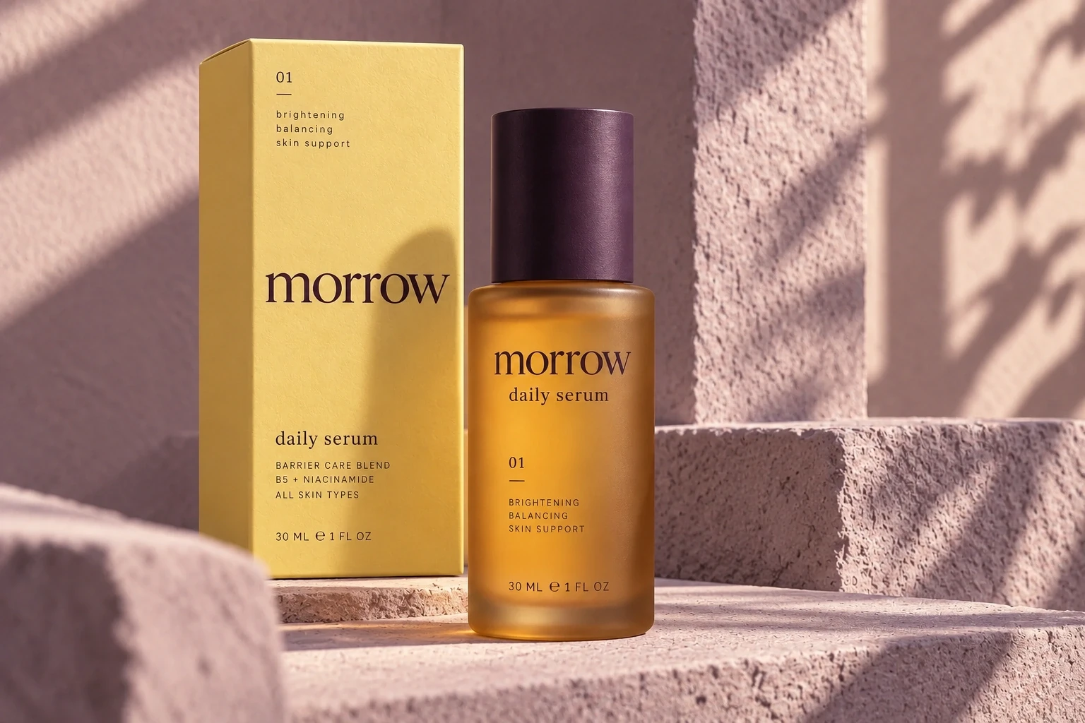
Daily serum
Amber glass and a plum cap give the first product a clear silhouette.
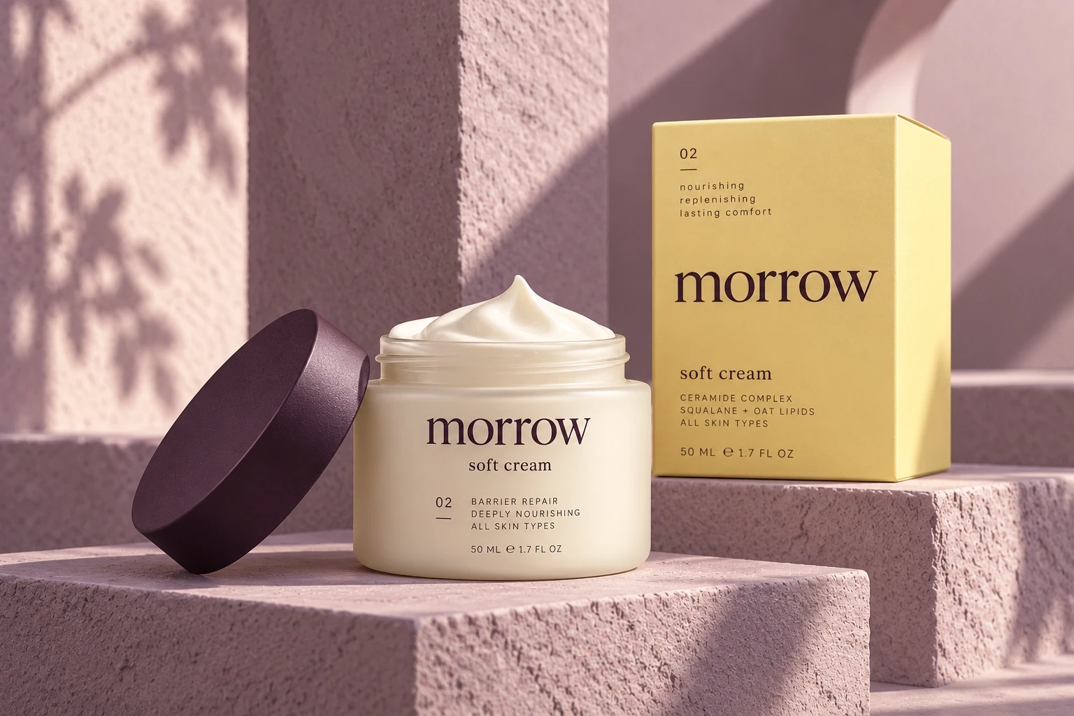
Soft cream
The second format repeats the same label logic and material contrast.
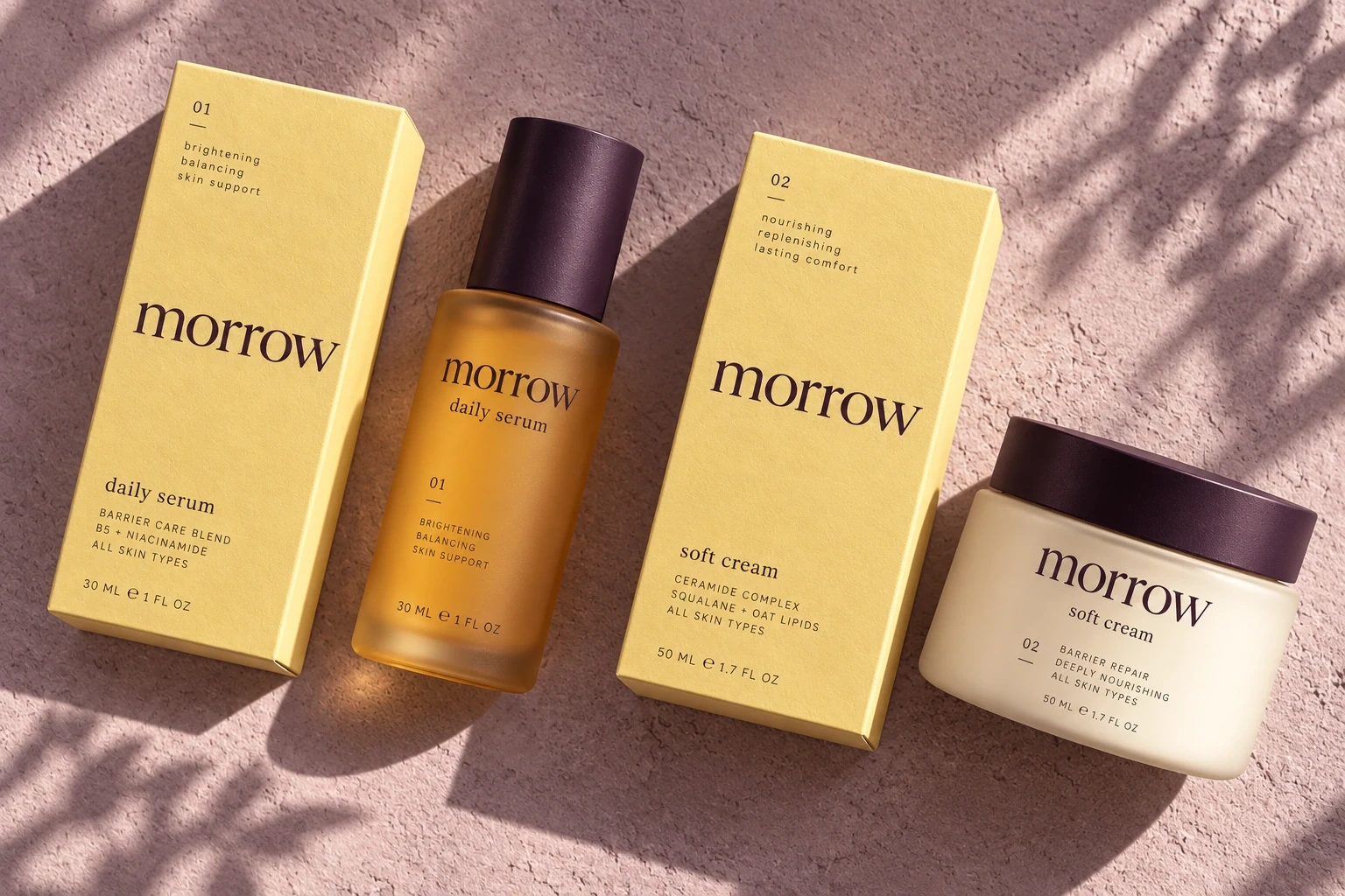
One family, two formats
Shared typography and numbering hold the packaging system together.
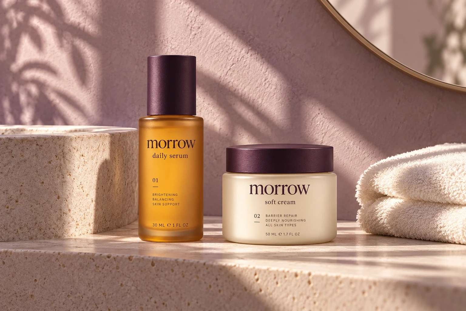
On the shelf
A quieter setting shows how the objects sit within an everyday routine.
NEXT CASE
© 2026 Ava Marlow. Fictional designer. Self-initiated concepts.