
Editorial design
X 0.00
Y
04
fieldnotes.case
ROLE
Editorial design
TYPE
Concept project
FOCUS
Pacing, image & reading
Case notes
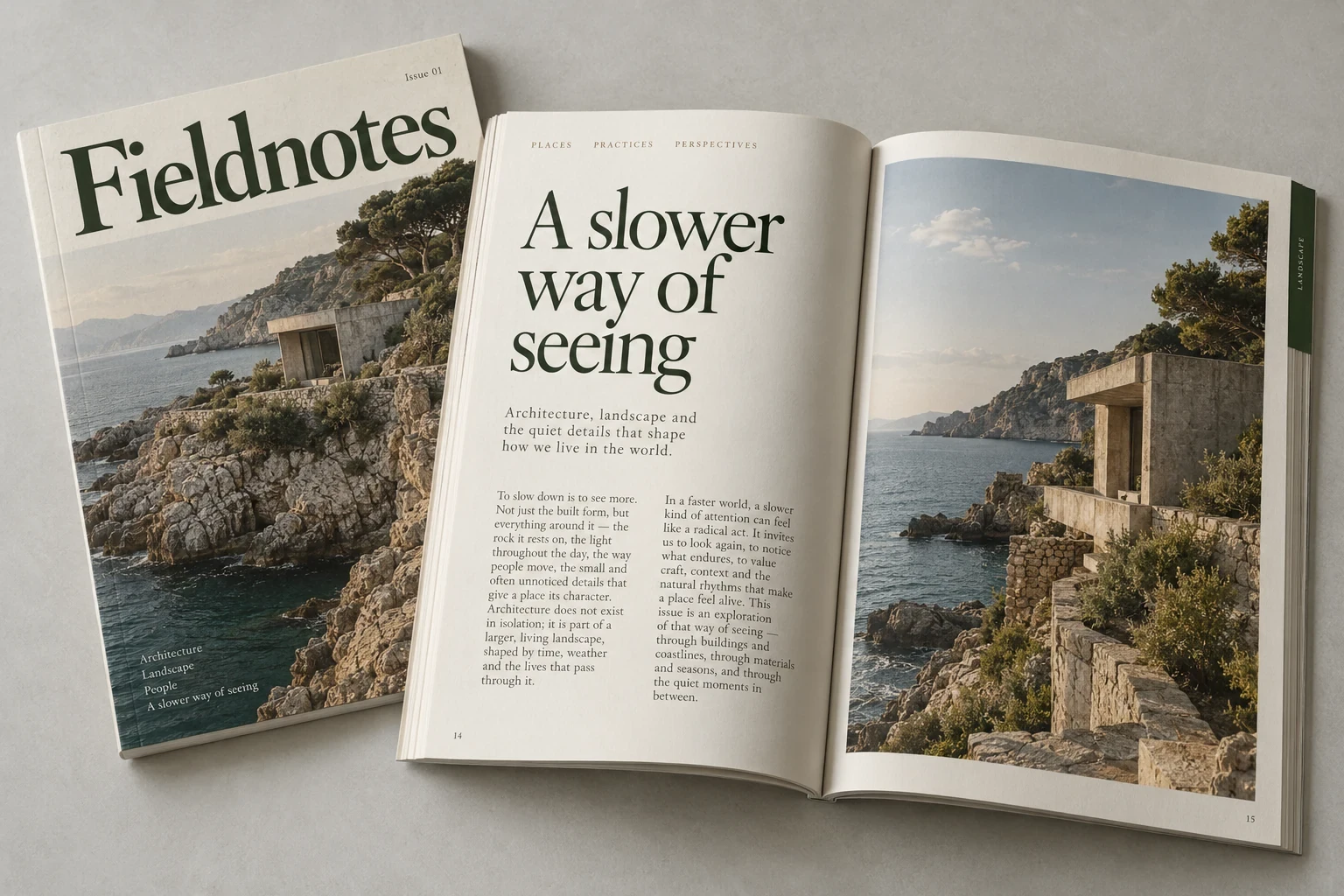
Fieldnotes is a self-initiated journal concept about architecture, landscape, and the details of everyday places. The design gives photography room to breathe while using a consistent typographic structure to guide the reader.
Create a publication that feels unhurried without losing clarity. Long-form reading, short observations, and large photographs need to coexist within one recognizable editorial system.
Case properties
Direction
Decisions
Scope
Dark green serif type sits on warm ivory paper. Generous margins, restrained section labels, and alternating text-led and image-led spreads establish a measured pace.
Brand system
Aa
A serif made for a slower read
An expressive serif gives the masthead and feature titles their character. Smaller serif text supports sustained reading, with restrained uppercase labels marking sections.
Forest
Paper
Stone
Sage
Details

First impressions
The cover uses one image and a clear masthead to establish the tone.

A measured spread
Text and photography take distinct roles within a generous grid.
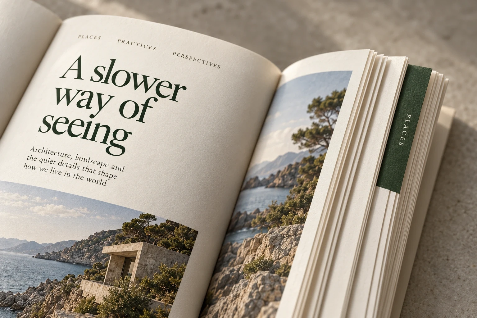
The object itself
Paper, binding, and small section markers add a tactile layer to the identity.
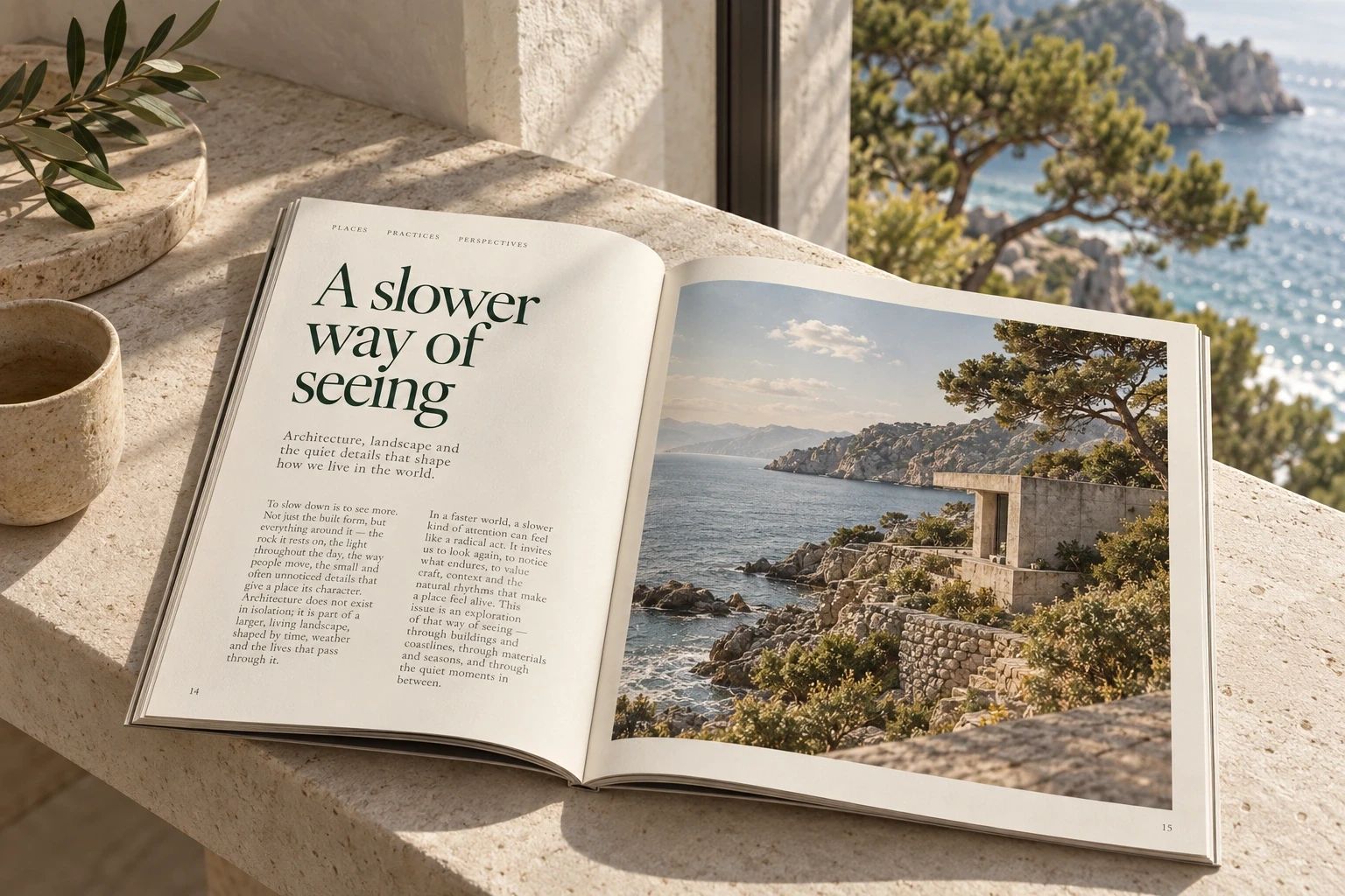
Room to read
A quiet reading scene carries the publication’s pace beyond the page.
NEXT CASE
© 2026 Ava Marlow. Fictional designer. Self-initiated concepts.