
Digital product design
X 0.00
Y
06
northwind.case
ROLE
Digital product design
TYPE
Concept project
FOCUS
Hierarchy & everyday actions
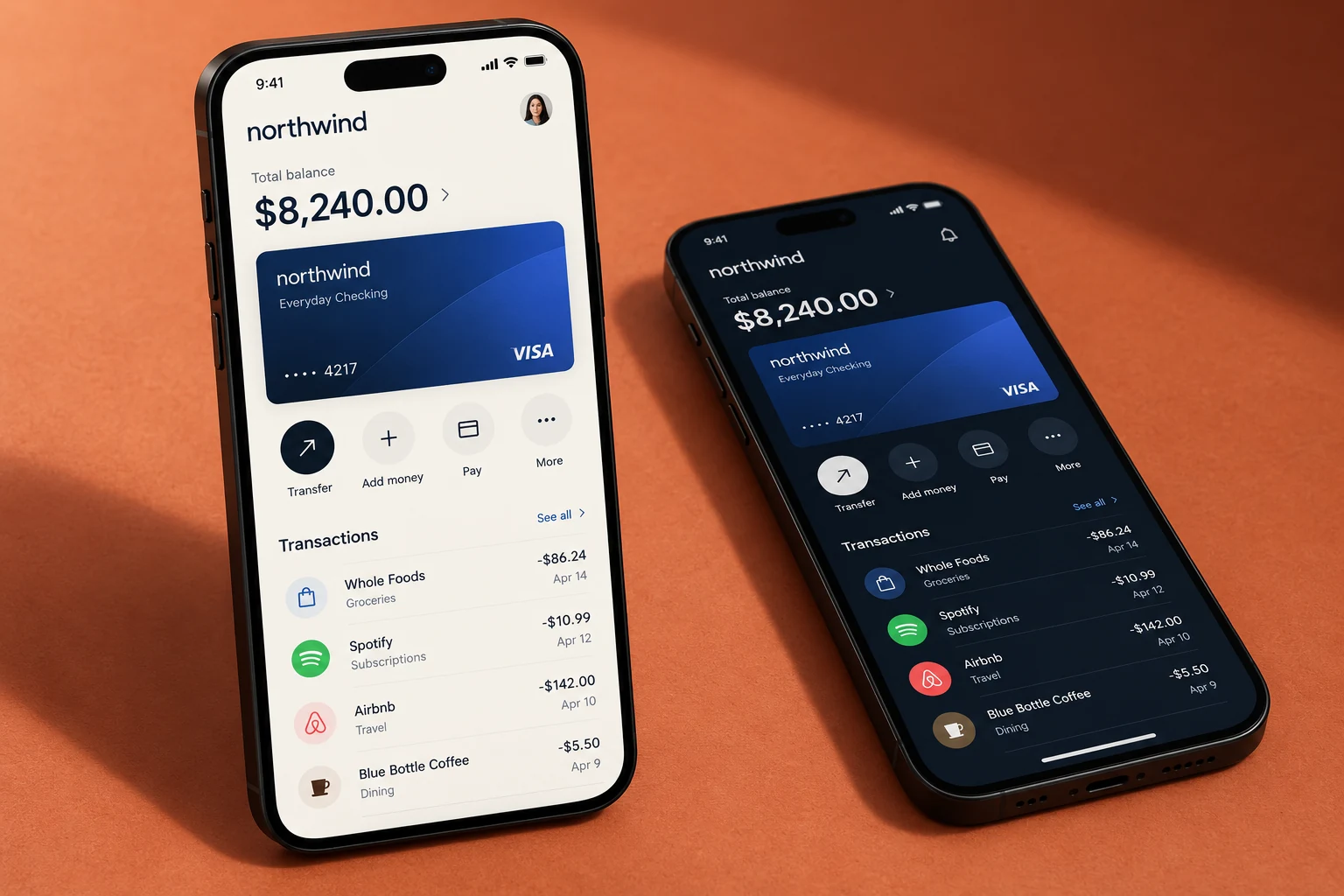
Case notes
Northwind is a self-initiated mobile banking interface concept. The project explores how account information, everyday actions, and card controls can share a clear visual hierarchy across light and dark presentations.
Keep the account overview easy to scan while making common actions visible. A financial interface needs to distinguish information, action, and confirmation without relying on visual noise.
Case properties
Direction
Decisions
Scope
Warm ivory and deep navy provide two related interface surfaces. Cobalt card graphics create a recognizable focal point, while generous spacing and direct labels organize the account experience.
Interface system
Aa
Quiet interface type, clear numbers
A clean sans serif supports compact navigation and larger numeric information. Weight, spacing, and alignment establish hierarchy without introducing another decorative type style.
Navy
Ivory
Cobalt
Terracotta
Details
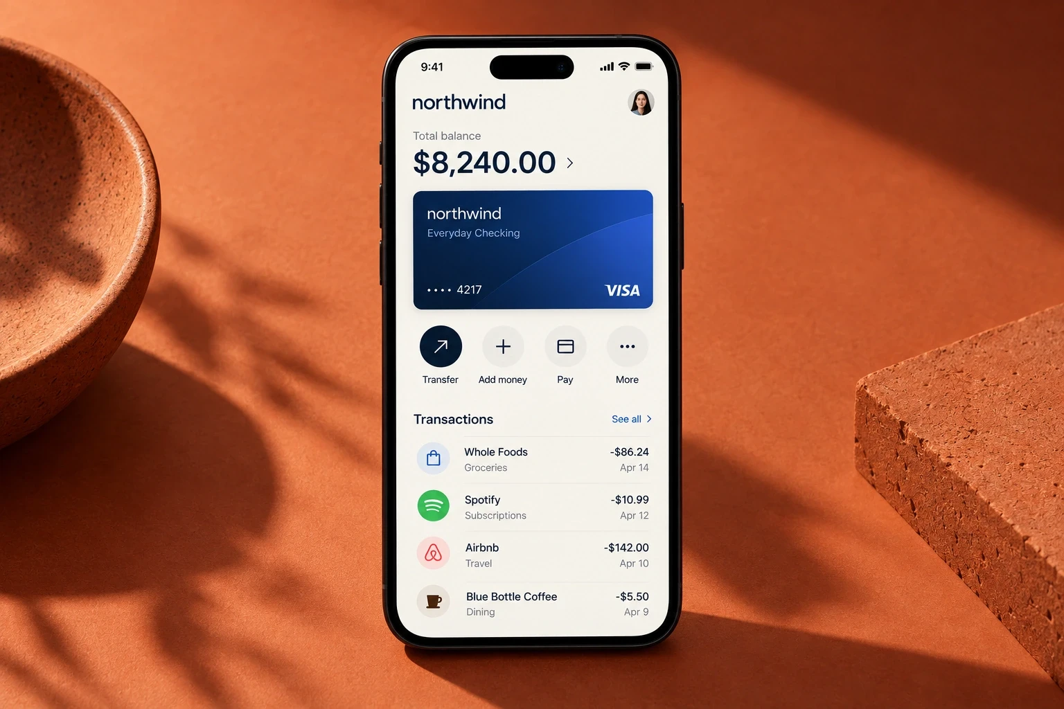
The account overview
Balance, card, and everyday actions create a clear starting point.
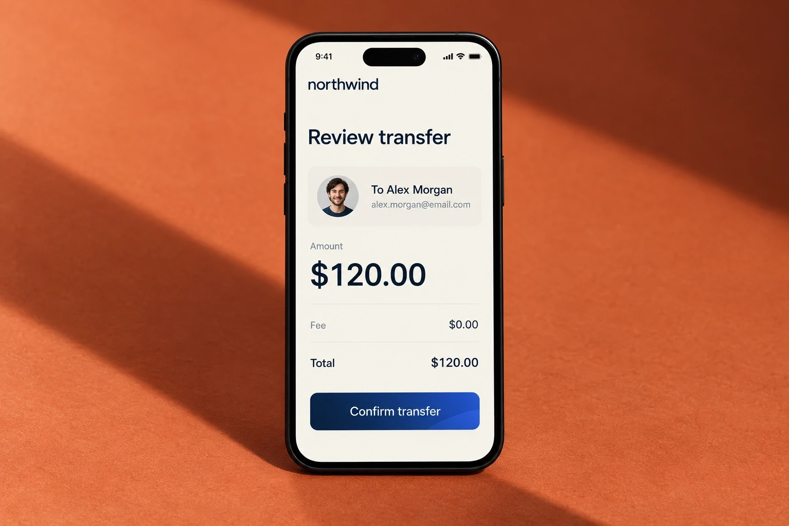
Before you confirm
A focused review screen brings the recipient and amount together.
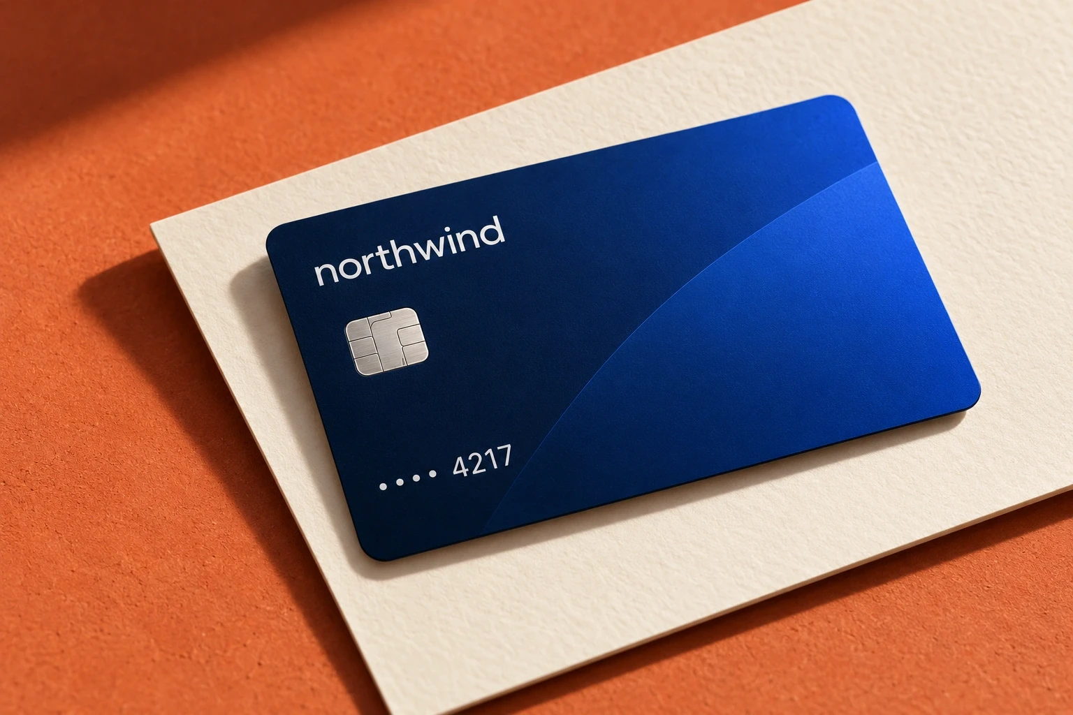
A recognizable card
A cobalt gradient gives the card its own identity within the wider system.
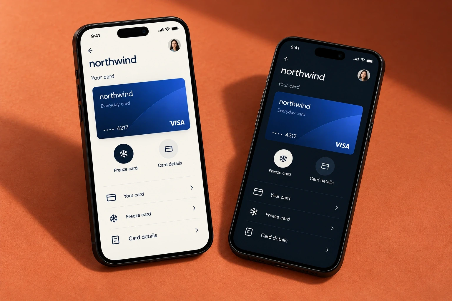
Two related modes
Light and dark presentations keep the same structure and priorities.
NEXT CASE
© 2026 Ava Marlow. Fictional designer. Self-initiated concepts.